


Hellboy: Seed of Destruction
It's Alive!
“Be not afraid of greatness. Some are born great, some achieve greatness, and others have greatness thrust upon them.”-William Shakespeare, Twelfth Night
American culture likes to feign its support of those who became great rather than outright admit so many of its icons were born great. This was a lie that took root in the mind of the populace as far back as the founding fathers rejecting monarchy and declaring that all men were born equal, when the realities of racial, gender, religious, and other discriminations did not reflect the claim.
Becoming great, is the central tenet of the American Dream, the belief that all who come here, and all born here, regardless of their position in society can climb the ladder out of misfortune and into a life of splendor. While statistically, the “temporarily embarrassed capitalist”, as described by John Steinbeck, is unlikely to ever shed their shameful shackles, the lucky few that ‘made it’, almost made it their mission to spread their greatness to the farthest corners of the country in order to perpetuate the boons of exceling beyond the protestant work ethic. As a former resident of Pennsylvania, and current resident of New York, the ubiquity of Andrew Carnegie’s name on centers of culture and commerce could convince an alien anthropologist that the man was an aged deity of the previous era. Born in a single-room cottage in Scotland, immigrating to Pittsburgh in his childhood, and rebuilding the city in his image via his steel company, the industrialist is the practical embodiment of the rags to riches narrative so deeply entrenched in the American mindset.
In his Gospel of Wealth, Carnegie claimed, ‘It is well, nay, essential for the progress of the race, that the houses of some should be homes for all that is highest and best in literature and the arts, and for all the refinements of civilization, rather than that none should be so.’ Through the construction of institutions like Carnegie Music Hall, Carnegie-Mellon University, and the Carnegie Museum, the steel mogul sought to live up to the ideals he espoused in his doctrine. Students educated in his ways, masses gathered under his roofs, art and information made easily accessible through paying homage to his name. My great-great uncle, the painter Joseph Fitzpatrick, taught art classes in the Carnegie Museum when he lived in Pittsburgh. You may know the work of one of his former students, Andy Warhol. With Pennsylvania’s steel industry now completely defunct, Carnegie’s legacy is represented less by how he made his fortune but rather how he ended up spending it. Humanitarian efforts however, were not the only property that Carnegie poured is wealth into.
Like old gods before him, Yaweh in The Book of Genesis, and Enlil in The Epic of Gilgamesh, Andrew Carnegie is not without his own ‘Flood Myth’. May 31st, 1889, a dam blocking the South fork of the Little Conemaugh River, located to the northeast of Johnstown, Pennsylvania, exploded. 20 million tons of water, more powerful than a locomotive, traveled down the valley pummeling the towns of Mineral Point, East Conemaugh, and Woodvale, collecting trees, corpses, and industrial debris in its journey. Johnstown was devastated by the rapidly moving 60 foot wall of water and the train cars, factory rubble, and barbed wire it carried with it. In total, 2208 people were killed, an unprecedented loss of civilian life in the U.S. at the time.
This was no natural disaster. The flood was precluded by over a week of rain, but the lynchpin of this misery lay in the poor maintenance of the South Fork Dam itself rather than the recent weather events. Initially constructed to be used as a reservoir for Main Line of Public Works canal basin in Johnstown, the dam and the adjacent lands were bought up by a group of Pennsylvania’s bourgeoisie. The new owners converted the area into an idyllic lakeside resort and shortly after dubbed themselves, the South Fork Hunting and Fishing Club. Among the club’s members were some of the most notable citizens of the region’s elite, Andrew Mellon-the banker and future Secretary of the Treasury, Philander Knox-a prominent lawyer and future Senator, and numerous investors and high level employees of Carnegie Steel, as well as the man himself. They were known as Pittsburgh speculators, who wanted a scenic retreat from the bustle of the city whose ledger they so carefully curated. While the club had appointed Daniel Morrell to evaluate the infrastructure of the dam, Morrel died five years prior to the flood with his pleas for more thorough repairs to the dam unanswered. While I don’t have grand conspiracy that Carnegie urged the club’s president to ignore Morell’s requests so that the dam would fail and wipe out the Cambria Iron company, a potential competitor, Morell’s business, and the source of so many lengths of barbed wire and railcars that cascaded down on Johnstown; it’s clear that the club’s pursuit of leisure, in lieu of sustainable development, is to blame for the mass-casualty event.
With the Great Flood of 1889 now clearly illuminated, it’s time to examine the conditions of another speculator driven crash, and one of the remarkable bastions that weathered its storm, Hellboy.
Hellboy is in the unique position to have found greatness in all three respects. The title achieved greatness through spawning a variety of spin-off titles, film adaptations, and video games. Amidst the comic book boom of the 1990’s Hellboy: Seed of Destruction # 1 sold 76,234 copies upon release, according to Comics by Perch’s sales analysis video. This would be a solid debut for a comic in today’s market, especially from a second tier publisher like Dark Horse; but in 1994 this certainly wasn’t the epitome of blockbuster comics.
The argument can certainly be made that the massive debuts of the initial Image titles, with Youngblood #1 holding the record as the highest selling independent comic book, and shortly after surpassed by Spawn #1, could not have been repeated two years later. In an interview with Duy Tano for Comics Cube, Rick Veitch noted that even by 1993, less than a year after Image’s debut, comic book stores were closing in concerning numbers as a result of the comic book speculator bubble bust; and that releasing each issue of 1963 on time was paramount to seeing valuable returns.
If you’ll excuse me I have to do some speculation of my own here, just a little bit, because I am having difficulty finding accurate sales figures for April of 1994. According to ComicChron’s logs for April of 1993 a book that sold approximately 76,000 copies placed it at 113 on the comic book sales chart. The book that held that position in April of 1993, one year before Hellboy’s debut, was issue 12 of Next Men, another title in the Legends imprint where Hellboy would debut, and created, ironically, by Mignola’s collaborator for Seed of Destruction, John Byrne. To claim that Mignola was something of an overlooked creator prior to Hellboy’s launch would not be an exaggeration. As you can see, Hellboy, even with its shiny “Issue 1” tag in an era of fresh-launch fever struggled to surpass the performance of Next Men, a book you’ve likely forgotten if you’ve heard of it at all, which would have been facing a year of waning numbers.
So how did a comic that landed with a relative thud upon release end up becoming an institution for upstarts and venerated professionals alike to display their talents?
To put it simply Hellboy was born great. The first issue is an electrifying showcase storytelling and design sensibilities one would be hard-pressed to find elsewhere in the medium. From the jump Mignola displays a bag of tricks that will become familiar throughout the duration of all the arcs to follow, but at least in my experience, retains the integrity of its magic.
We are catapulted immediately into the narration of Sergeant George Whitman, in the waning months of World War II. Complemented by the arresting imagery of a church in ruins Whitman, details the anxieties of his superiors alongside his skepticism of the supernatural events set to transpire that his unit is responsible for preventing.
“Okay— this is what we think we know: Hitler has sent some kind of team to England. I called them commandos, but there’s a trio of people from the British Paranormal Society who say they’re more than that. They say the Germans are some kind of spook squad. That the Krauts are here to perform some kind of spell or something. Summons monsters. Raise the dead. Yeah, right.”
He concludes on the following page:
“And in charge of this whole Looney Toon party is me, a guy who’d never even heard the word “paranormal” before a week ago…”
Whatever fear and confusion the Sergeant may be feeling he’s certainly masking it well with the kind of machismo that would feel at home coming from the lips of comic book alpha-male like Wolverine—and with the line being written by John Byrne, the Alpha-Flight Alumni’s star manager, it’s no surprise. The journal entry provides incredibly thorough characterization for a character who is allotted a lowly two panels of real estate throughout this entire first miniseries.
I’m going to dissect Mignola’s art in concert with Mark Chiarello’s colors a number of ways throughout this article, but if I could summarize the triumphs of this collaboration with an age old quote before we begin, it would be “Less is more”.
Mignola is not a pioneer of the chiaroscuro inking in comics; it wasn’t even a radical tide for him to surf within the confines of the era or the output of Dark Horse. Three years prior, Frank Miller debuted Sin City within the pages of Dark Horse Presents #51, reviving the crime genre, and paying crass homage to foreign masters like Jose Munoz in his noir series Alack Sinner and Hugo Pratt with his swashbuckling Corto Maltese books. The high-contrast brush inking that Miller employed with its dead-line detailing would quickly find imitators in mainstream books. In 1993, Jim Lee presented his own take on the heavy brush spotted black style in the pages of Deathblow, and would be succeeded by another devotee of Miller, Tim Sale. 1993 would also see the launch of The Maxx by Sam Keith, and even in 1994, debuting alongside Hellboy, Jae Lee would begin his series, Hellshock, marked with its own interpretation of heavy black and stark patches of light. Where Hellboy surpasses its peers is through the subtle but confident hand of Chiarello.
I could, and probably will, devote an entire year of this blog to Mark Chiarello’s editorial efforts in organizing some of DC’s best projects like Batman Black and White, Solo, and The Wednesday Comics, but for the sake of this article I’m going to do a close examination of the perfect touches that he adds to Mignola’s inks. His flourishes are not without gradients, but they are few and far between. A suggestion that those within the Wildstorm Studios color house were reticent to consider, to say the least.
A sunset fades from from light tope to a light, muddy clay brown, and then from mauve to tope as twilight sets in on the first page. The cross and the shrubbery surrounding it bear the colors of a rusted penny—deep copper and sickly green. It feels ancient. It feels revered. The fields of solid color, even in darker registers, compliment Mignola’s inks unlike the radical gradients which combat the inks of Jim & Jae.
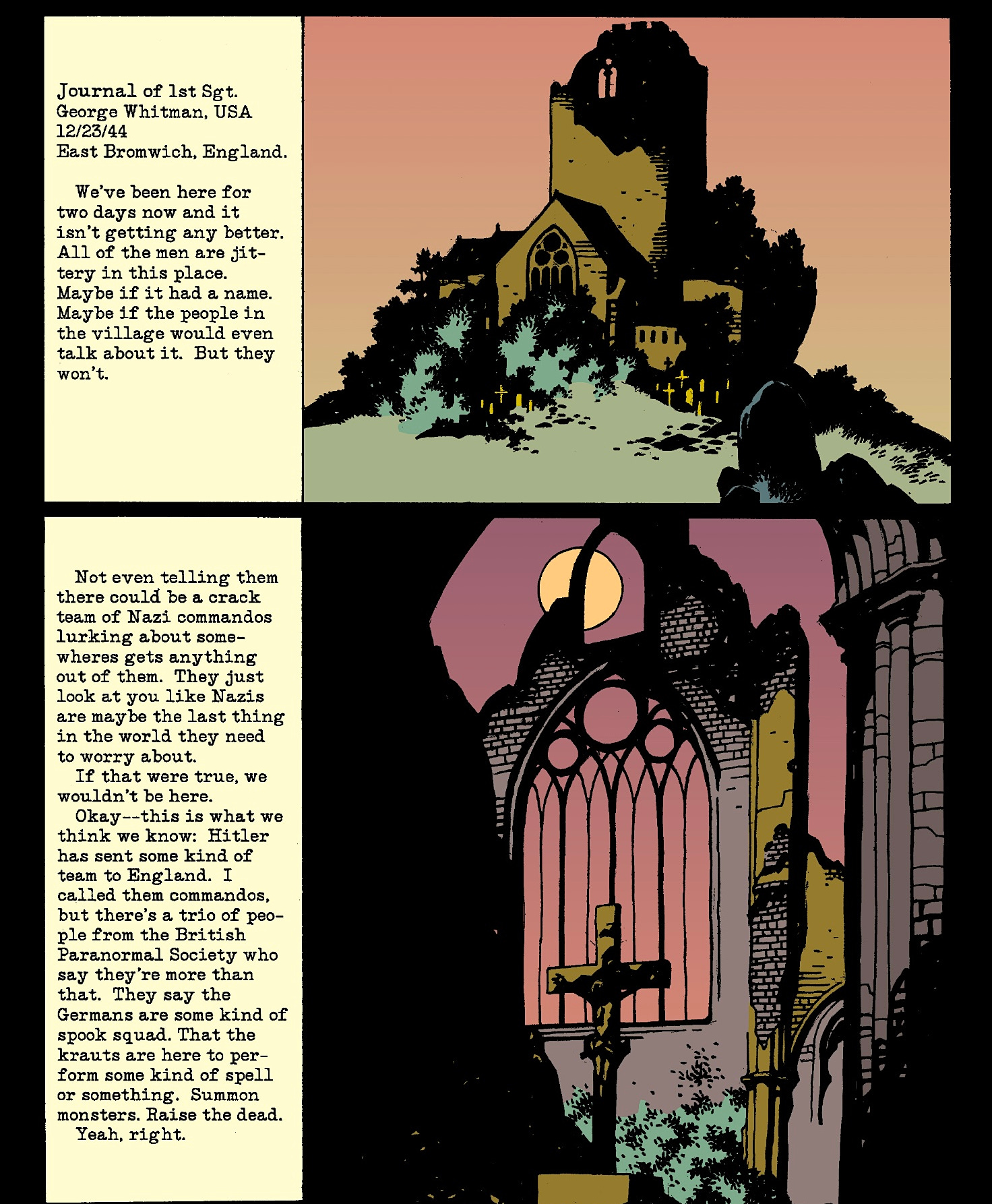
Without directly mimicking the disparity of Sin City’s black and white, Mignola and Chiarello harmonize with it. Even the darker purples and deep greens that Chiarello will fill this book with bend their knee to the palette’s master—pure ink. It doesn’t take many pages to notice how much of the page is drenched in shadow. Even the gutters are black. On page six, when Chiarello delivers a panel with no black ink, Mignola’s ink line turned cyan set against pure white, it stands out in electrifying rebellion to everything we’ve seen so far. It signifies a change to the natural order, an aberration against the world as it once was, and on the page following a magnificent, crucifix obscuring thunderbolt, Hellboy arrives.
On the pacing end of things here, Mike is juggling plot threads so naturally that you would feel he’s breathing. The journal entry has caught the reader up to speed exactly at the point that this book becomes ‘cool’ to draw. I could look at anything in Mignola’s style, and there’s no reason to think I wouldn’t sit through five pages of GI’s setting up tents in the rain or what have you, but Mike isn’t about to waste valuable page time separating us from Hellboy. Light brown biblical stonework serves as a frame in the top half of the page surrounding a dark orange panel of Sgt. Whitman and Trevor Bruttenholm discussing the absence of any abnormalities in the region.
They’re interrupted by Lady Cynthia in a periwinkle dress. This shade almost matches up with the open evening sky in the panel below, an island miles north of the Allied forces, that she’s locked onto in a vision.

The story rapidly transitions its information delivery mechanism and location on the same page without either change feeling abrupt. The lavender sky, behind the faux stone-henge rock formation, does a good job of selling the passage of time from the sunset hues from page one, convincing us that the sarge’s impatience is palpable. On the following page we meet Project Ragnarok.
Without praising some of the most despicable people who have ever lived, I will say it’s hard to overpower the infamous design sensibilities of the Nazis. They were an army dressed by Coco Chanel, a man whose brand is worth billions today. When faced with this challenge, Mignola draws the hell out of what works, the officers’ caps, the coat lapels and collars, the leather gloves, and adds his own unforgettable touches. Perfectly circular goggles with opaque lenses that wash the emotion out of each soldier’s face in favor of a sociopathic, blank stare. Von Krupt’s goggles sport a single swastika lens that make him look especially sinister, but not as freakish the man in the gas-mask next to him, or the figure in the center of the panel below. Cloaked in black, covered in sigils, and gloved in gauntlets adorned with voltage coils, loose wires, and clunky metal rings—you really couldn’t ask for a better druid design to wake the devil.

It’s clear that the aim of the experiment is far beyond the technological capabilities of the time period. There’s a lot that Mike Mignola owes to Jack Kirby, but I’m gonna mince hairs here and wager that when it came time to make the 2011 Captain America movie, the costume and production designers were looking more closely at this page than they were the Nick Fury comics where Hydra first appeared.The World War II sequence concludes with Bruttenholm christening the infant in the flames “Hellboy” and a group photo of the GI’s with their freshly summoned freak. It’s a great way to play around with what a panel can be, as opposed to what can be in a panel. It also firmly roots this sequence of events as the past to set up the present of the following page. It’s a little bit funny to see something as modern as the silhouette of the Manhattan bridge in Mignola’s style, with so much of this series taking place in dilapidated castles or ancient ruins, that I can’t help but relish in this little taste of the new world Mike gives us. The following panel features an inset image of a tape recorder playing Bruttenholm’s summary of Hellboy’s arrival within his study, and study I will. The set dressing of this sequence is positively divine. Bas reliefs and fragmented stone sculptures stand against pure black walls, the professor sits in pure silhouette against his cyan windows, and dogeared books block the full view of his desk and cabinets in the foreground. If comics are supposed to be a marriage of words and pictures, the audio-log noting that thirty-five years have passed since the opening sequence may be the wedding vows in this arrangement, the scenery is the reception; an exhibition of that union for us to engage with. When we read the speech balloons in the panels below,
“Closer to fifty now…and yet, so much more. as though it belonged to another lifetime. Someone else’s lifetime. Not mine anymore,” it’s justified by the clutter of the establishing shot, and the gnarled hand on the photograph.

Trevor has surpassed worldliness. He is world-weary and the staging of his reintroduction here suggests he is not weary of but one corner of the Earth, but all of them. This is a lot of analysis for for one panel but if there’s one thing that the maximalist comics of the nineties were sorely lacking, it was an indication of a world lived in. The hyper-masculine taskforces of the Image boys, moved through sterile futuristic corridors, or posed in empty voids for money-shot original art pieces. I’ll cop to having more unironic enthusiasm for the early Image books than most, but I really have to highlight how Mignola trounces Rob Liefeld, to be specific, due Mignola’s incredibly controversial fill-in issue of X-Force.
On the other end of the exaggeration spectrum, the residents of Sin City bash their way through nigh German-Expressionist stages, or pitch black pits.

Mignola’s style is not without the signatures of German expressionism, although I don’t have the filmic fortitude to tease out everything that his work on Bram Stoker’s Dracula borrowed from Nosferatu, but those influences are more relevant to the blocking than the exaggeration in Hellboy.
Asymmetrical distribution of characters and background elements that unites the forms of the page while highlighting their diversity. The artifacts in the Brooklyn office are magnificent, but they are concrete. The drawers on desks have form and function, and the statue of Vishnu that stands behind Hellboy, subtly marking him also as a destroyer of chaotic forces, stands with reasonable proportions. For the elements that this is going to borrow from Jack Kirby’s Eternals in a few short pages, the impossibility of the relics is not one of the aspects that Mignola displays in this office. The textures and the shadows may align with Kirby’s ethos, but it is Kirby’s texture applied to carvings in our world. As Hellboy and Bruttenholm’s conversation shifts towards the older man’s recent Arctic expedition, Chiarello employs a subtle gradient on the weary traveler’s face as it shifts from peach to pink around his nose as if he’s come in from a biting cold followed by a radical swap to light cyan in the following panel to prep the viewer for the icy polar sky of the following page.

Bruttenholm’s skin is not peach or blue in this panel, but rather a light clay, that demonstrates that though the Sun may be shining on the snow bright enough that the explorers all adorn sunglasses, the light brings with it no warming effect. Mark has marked these ill-fated adventurers for death with the pallid palette of a corpse.
When Jack Kirby returned to DC after his unmatched tenure at Marvel, he introduced the world to the New Gods. Mike Mignola, like Kirby before him maintains a fascination with with the works of H.P. Lovecraft. Hellboy does introduce new gods, but the setting of the arctic expedition is really an excuse for Mignola to make Lovecraft’s old gods new. Bruttenholm’s narration provides the readers brief glimpses of Sadhu-Hem, a monstrous form, baring both mollusk and fungus like features and a Rasputin so coated in soot that he isn’t instantly recognizable to the reader as the cloaked figure from the introductory sequence. It’s also reminiscent of the first issues of New Gods and Eternals, where normal men and women cross paths with dark divinity, but unlike Kirby whose goal was to elevate the language of superhero comics to mythic proportions, Mignola cloaks his comic in gothic traditions.
The broken memories of Hellboy’s mentor and the skeptical journal entry of Sgt. Whitman occult the events from definitive revelation to the reader. Whitman’s entry is not unlike the bewildered captain’s log in Dracula, discovered in the wreckage of the Demeter. Bruttenholm’s piecemeal recollection is an obvious send up to the insanity Danforth is unable to overcome in the finale of At the Mountains of Madness. Where Kirby sets his protagonists on the hero’s journey, Mignola plants his in the garden amongst the seeds of destruction. Doom is imminent.
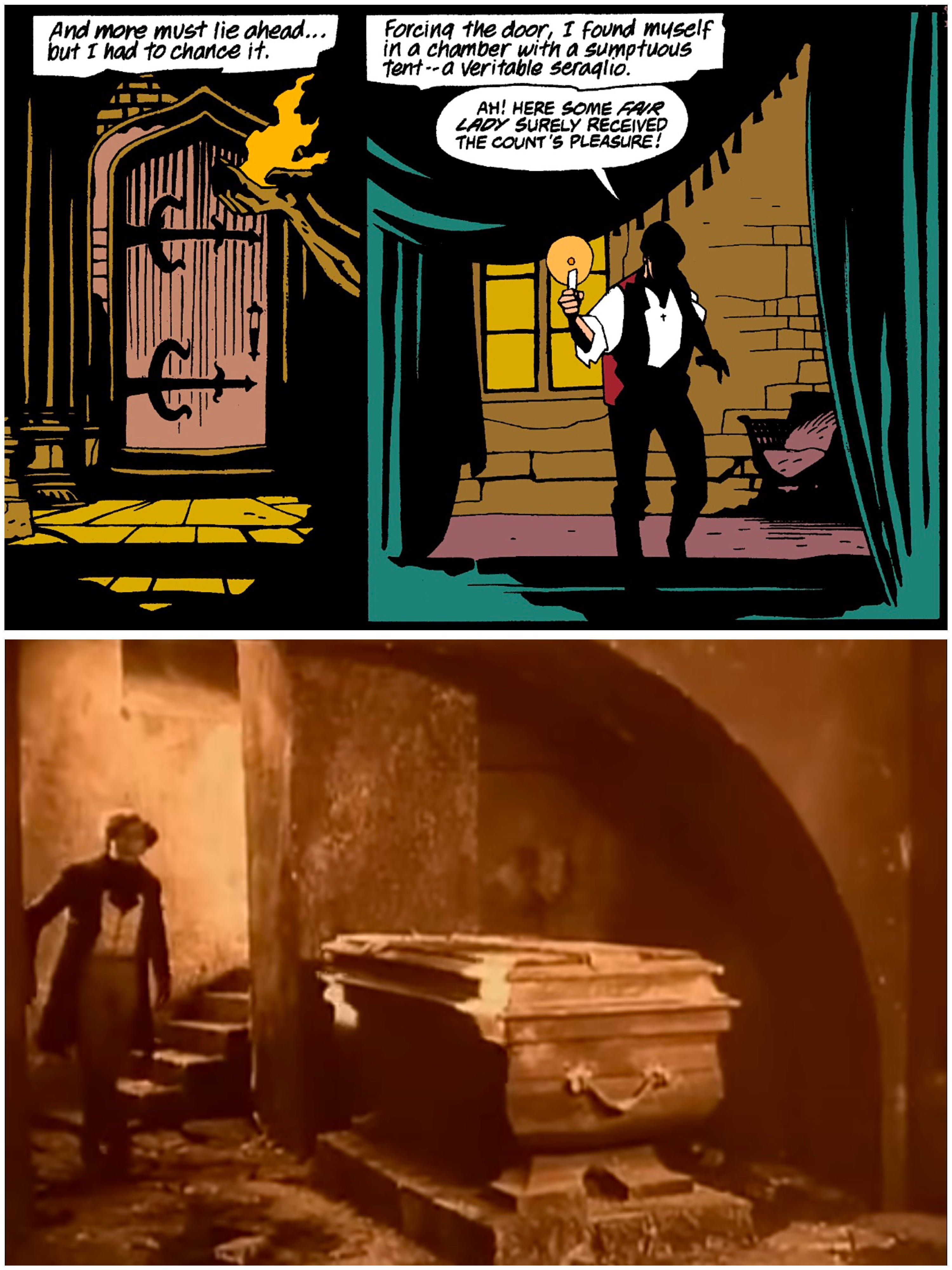
Bruttenholm is abruptly killed following a rain of frogs outside his window, by an unseen creature in the next room. When his corpse is tossed back into Hellboy’s view, he’s covered in disgusting welts and his frail wrist hangs with the perfect dichotomy of limpness and rigidity to denote rigor mortis. Byrne provides a hard-boiled inner monologue for the big red bruiser here that wouldn’t sound completely out of place in a Sin City comic on the rack next to a this, but is clearly the voice Hellboy is meant to have, and not a cheap imitation.

The frogman Hellboy battles is admittedly, not the most iconic design in the world, but it’s big enough and ugly enough to present a threat for the time being. A few more thoughts from Hellboy let us know what’s going on with that big stone hand of his…which is to say, it’s not of Earthen materials and it’s good for smashing. The fight between Hellboy and the frog monster isn’t the choreographed dance of Miller’s work on Daredevil, but it has momentum and stakes. Hellboy’s arm is numbed by the same pockmarks that dispatched his adoptive father, apparently a result of the creature’s venomous tongue, preventing him from immediately drawing his pistol. He relies instead on the Chekov’s gun grafted to his right arm, and we get to see him smack the beast around with the bludgeon he was born with. If you introduce a giant fist in the first act, someone is getting bonked with it in the second. The backgrounds drop out to place emphasis on the successive action until Mignola decides to make the eclectic set dressing into weaponry, and delivers a truly spectacular three panel sequence of a frogman smashing into a sarcophagus and exposing a decaying mummy. Having spent a little bit of time working in an auction house, I can tell you exactly which warehouse in Brooklyn I would choose to fight a frog man in, if I thought recreating this set of events would spare me my life. With one massive bullet, Hellboy obliterates the batrachian bad guy and a skeleton shatters on the floor. As a kid, this scene always confused me, a little bit. I didn’t really understand why all the flesh seemed to evaporate from the corpse in just a few panels, but looking at this page now, I can appreciate both the eerie finality of its complete dehumanization, and the kineticism with which the skull bounces and the rips split apart. It is, if a little abrupt, a memorable death.

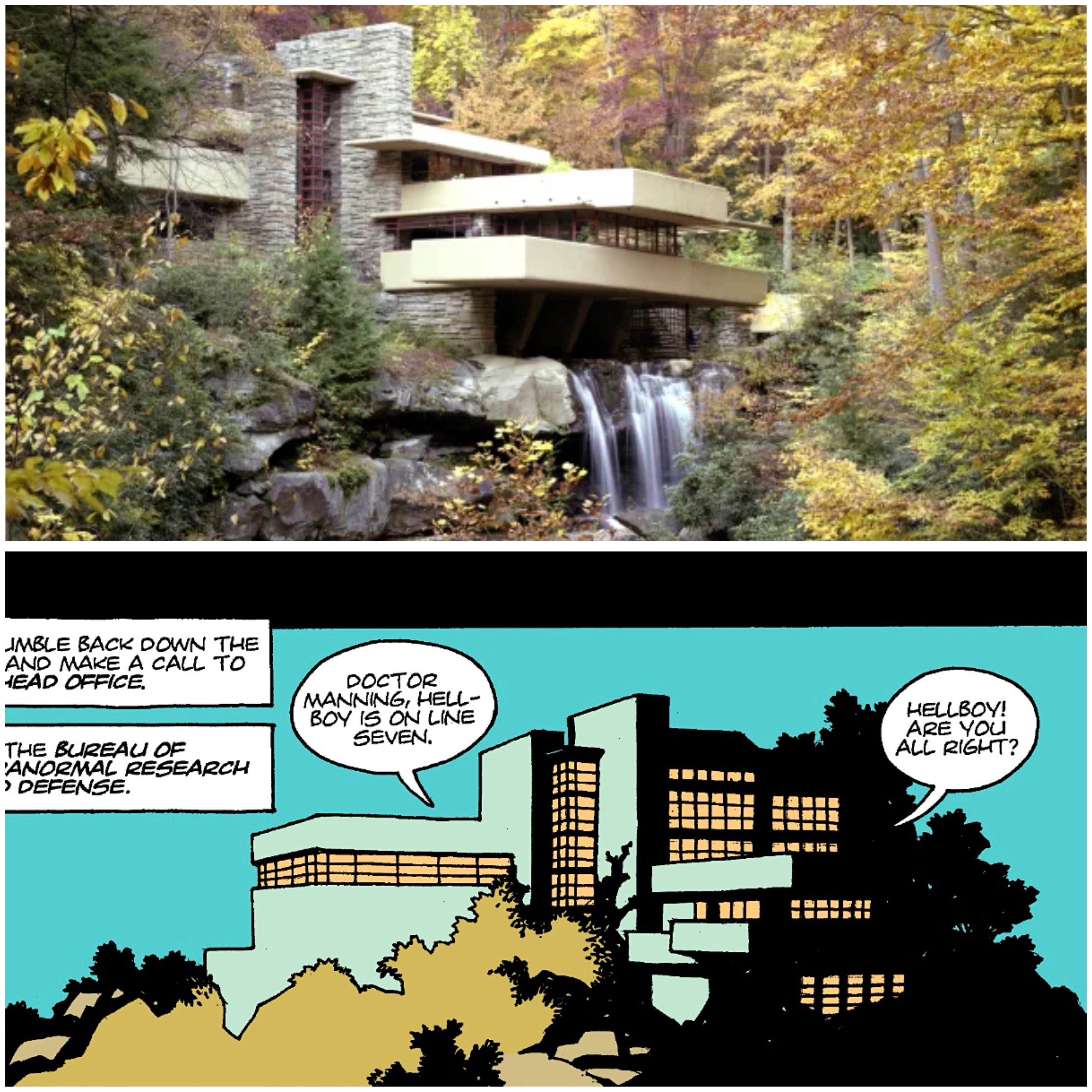
The last few pages present us with some more, rare, modern architecture, with an establishing shot of the Bureau of Paranormal Research and Defense’s headquarters, which would fit in next to Frank Lloyd Wright’s preliminary sketches of Falling Water and whose name I can only assume, lit a fire in the imaginations of SCP writers across the globe. Hellboy recounts the events to Doctor Manning over the phone, who with a simple line, articulates his respect for our lead, without assigning him any rank. “Right, yes, of course. You’re free to assemble your own team as always.” It’s brief, but it clues you in to how the ship runs and illustrates that our guy has really been at this for a while.
Following this we get one page of a gothic mansion’s interior where eerie portraits and shadowed furniture surround an old woman speaking with a silhoutetted figure. She hints at some bargain made with this devil, and a frog lifts its head from the fine China teacup sitting in her hand. It’s not grand, but it is captivating. For all the bravado Mignola displays with the mechanisms used by Project Ragnarok, or the grotesque creature design of the beast in the Arctic, it’s quieter moments like these that really sell the horror of this series. Mignola can portray bombast when necessary, but minimalism is his most compelling magic trick.

Mike is on record, stating that Frank Frazetta, one of his biggest influences, examined Mike’s work, and identified more aspects of Alex Toth in Mignola’s style than his own. This came somewhat as a shock to Mignola who professed no slavish devotion to Toth, but it’s clear at least, that the ethos of one of Toth’s most memorable quotes, “Strip it down to the bare essentials and draw the hell out of whatever’s left,” is one that Mignola abides by.
The single issue concludes with a data file from the BPRD, illuminating the backstories of some of Ragnaraok’s key players. I should note that Rasputin, the cloaked figure from the ceremony, later seen sitting at the base of the statue in the arctic, is unidentified in this file, and won’t even officially be named when this arc concludes. There is a simple, but effectively spooky juxtaposition here, where Doctor Kroenen, the Nazi in the gasmask in the ceremony, still garbed in his ghastly equipment, not a trace of skin showing, is identified in this document, but the bald figure next to him is a complete unknown.

Even the choice to depict Kroenen with a professional headshot, denotes him as part of a bureaucracy, while the unnamed figure, angled partially away from the camera in his photo, standing in a clearing in the woods, implies a detachment from the organization under scrutiny. There’s a candid quality to the image that presents the sense that it must have been gathered through more advanced espionage tactics than those used to acquire the information on his compatriots, and even that extra dedication was not enough to uncover the truth.
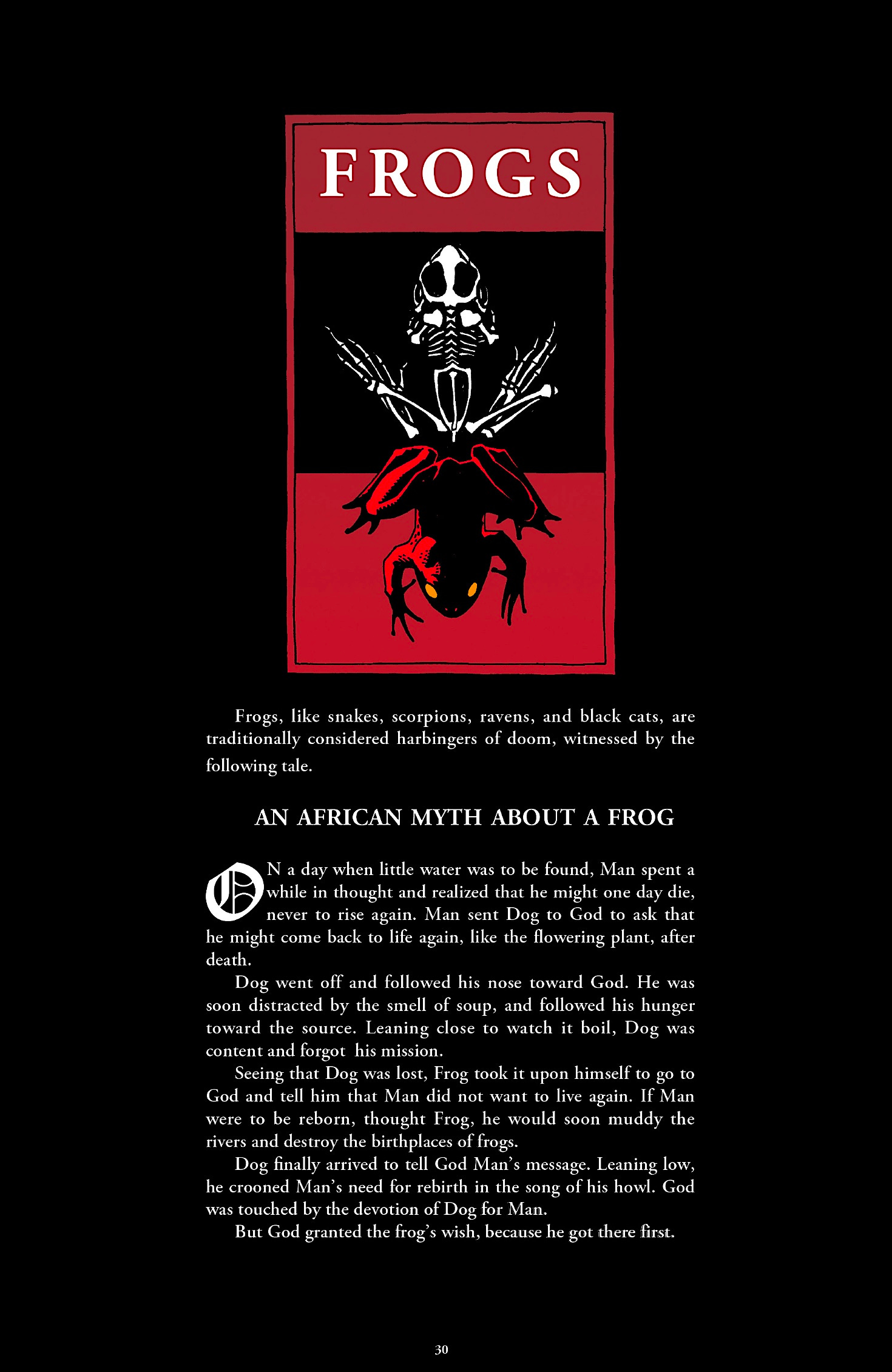
The African myth about the frog, is I believe, an addition for the trade paperback so we’re cheating a little bit here, but maybe I’m wrong and it was in the original printing. I cannot find any direct root for this myth, I think it’s an invention for this series. If that’s the case, those who have finished the series, or at least read the Plague of Frogs saga in BPRD will see that Mignola had his eye on his finale from at least this moment. This tale in an of itself is not a flood myth, but it resonates with the Johnstown flood. Progress for man produces disasters in nature, and man dies as a consequence of his ignorant muddying of waters.
I don’t know if there is a perfect first issue out there, but when searching for the criteria, you could do a lot worse than Hellboy: Seed of Destruction #1. The star makes a bombastic entrance into a world that is familiar, yet buttressed with grotesque abominations. While Hellboy’s performance as a character could use some more emotional depth, as he’s only given one panel to really acknowledge his surrogate father’s depth, we understand the role he plays in the BPRD, and how he reacts in the face of danger. His design is compelling, and getting to see our protagonist get his hands dirty right out of the gate is a reasonable priority for Mignola to focus on in an action comic, even if the series becomes slower and more poetic as it wanders into more of the folk lore aspects. Additionally, the reader is transported to six different settings in a brief 24 pages, each with their own visual identities, with transitions which naturally slot into the narrative and conversations, rather than jerking a winded audience from stage to stage. There are questions that go unanswered, but not in an unsatisfying way. The biggest weakness that I identify is the lack of emotional connection between Bruttenholm and Hellboy prior to his death. This is something that Mignola himself expanded in prequel series and flashbacks, following John Hurt’s performance in the first Guillermo Del Toro movie, so that future installments would have more supplementary material for the actor to work with.
The Legend line was launched by Dark Horse as an answer, and in many ways a rebuttal of Image comics. Where the ex-X-men artists were printing splash pages to sell posters or original art of, Dark Horse’s mavericks would tell stories. The caliber of the creators that made up this team was incredibly promising, however Legend was not long for the world. John Byrne, the most prolific of the ensemble, only produced 22 issues of comics under the imprint across four series. That can be rounded up to 44 issues, if you count the 18 issues of Next Men he produced prior to the official formation of Legend, and the four issues of Seed of Destruction he scripted the dialog for. Art Adams, whose style many of the Image founders chased, debuted Monkey Man and O’Brien as back up feature to Hellboy. While his work is captivating to look at a combination of disinterest in the story from both him, readers, and his laissez fair schedule led to the series conclusions after three issues of material were produced. Geof Darrow, would produce two mini-series with Frank Miller, Big Guy and Rusty the Boy Robot, and Hard Boiled. A notoriously slow, virtuoso, Darrow would find providing concept art for The Matrix, a more lucrative endeavor than print media; while returning to Dark Horse every so often, with a new Shaolin Cowboy mini series. Frank Miller, in his collaborations with Darrow, Watchmen’s Dave Gibbons, and his solo efforts on Sin City would provide the next largest body of work for the line. It should also be mentioned at this time that Dark Horse was trying to build its own house-superheroes in Comics’ Greatest World, the most famous of which is likely Barb Wire. Yes, the same Barb Wire that Pamela Anderson played. Hellboy wasn’t the highest selling or the longest running title from Legend, but Mignola dedicated himself to continually reviving the series when his compatriots either let their series languish, or returned to mainstream publishers to pursue more high-profile projects. The Greatest World imprint, was a laughable failure, excluding the technical inclusion of three mini-series for The Mask, all of which succeeded the Jim Carrey movie that you’re likely more familiar with anyway. So, in the face of being known only as the company that licensed Star Wars and Alien, greatness was thrust upon Hellboy.
The title served as the beacon for more off-beat creators to take Dark Horse seriously as a home for their passion projects. This isn’t to downplay the significance of Sin City, one of my all time favorite series, but it’s rotating cast, irregular schedule, and Miller’s high profile, neither produce as iconic of a mascot as Hellboy, nor signify attainability to lesser known artists. Something I maybe should have mentioned earlier was that while the now untouchable Mignola, had a measurable career at Marvel and DC comics, his work there certainly wasn’t beloved. That issue of X-Force I mentioned earlier was followed by one of the most indignant and reactionary letters columns that the title and company would ever face. Almost a decade later, when fellow Legend veteran, thick brush inker, and Mike-name-haver, Allred would assume art duties for the title, the outrage would return. All this to say, Dark Horse and Mignola’s partnership, would not only contract masters like Richard Corben, for brief stints on Hellboy, but it would be used to attract auteurs like Stan Sakai, Sergio Argones, Matt Wagner, and Jeff Lemire, to name a few. Dark Horse’s overhead is likely supplemented more by manga it licenses, Berserk, in particular seems to be immensely popular with my generation, but some of western comics greatest talents were fostered within the Hellboy stable. To name a man who has carried it seems, some of the best books from several publishers on his back, colorist Dave Stewart properly made his bones in the pages of Wake the Devil, after collaborating with Mignola on an Aliens one shot years prior.
There’s a lot to explore in the Hellboy Universe, and even I haven’t read every title to completion. If you’re a few volumes deep into the main title, and want something a little different, BPRD, probably my favorite spin off, is more action oriented, while Sir Edward Grey, Witchfinder distills more of the romantic and gothic elements. Most notably though, Mignola has returned to drawing duties, on actual comic book interiors, for the first time in several years, with the release of Bowling with Corpses. I haven’t had a chance to check it out yet, but I’m excited to see how he begins his process completely anew for this graphic novel. As it progressed, the Hellboy series tried to include more fairytale elements and, but I’m excited to see Mignola tackle these old legends, without a brick-boxing glove bashing the hell out of them.
Thank you for reading.
I will be back, hopefully in early March to dissect another nigh-unassailable Issue #1. I’m considering tackling issues I have more mixed opinions on after I’ve developed a little bit of a baseline for myself of what I truly believe a monthly comic should be. My return may come with a less historical focused prologue, we’ll have to see. It was fun to approach this with the scrutiny and swagger of Walt Lewellyn, host of the Black Casebook Podcast, but I’m not sure I have the intellectual breath to maintain that. If you somehow discovered this and haven’t listened to his show, but enjoy analysis in this manner, I highly recommend it.
In the mean time I’ll be posting some of my comics on here that you can investigate at your own risk. I would say CYMK Ultra: Guns, Knives & Crosses, and Kry Thunder! were the two issues I consciously analyzed and attempted the reproduction of parts of Mignola’s work the most, but he has captivated my eye and my heart for over half my life now, if not a little earlier, when little Catholic school Graham and his Mom looked at the ads in Star Wars comics with confusion over the comic that was bold enough to print “Hell” in its title. Side note, I have since convinced my mom to read some of the Hellboy minis, especially the Hellboy in Mexico bits from Richard Corben.